
CI
CI
The EXPORUM logo embodies the way one business connects with another,
growing into an industry and pioneering new possibilities in Korea and beyond.
CORPORATE IDENTITY
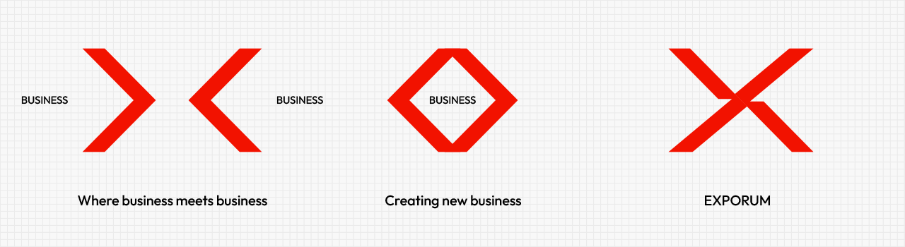

EXPORUM's new brand identity expresses, through the letter X, the meeting ground where existing businesses come together to create new business. The X also signifies infinite possibility, and EXPORUM emphasizes a global mood to represent the center of that possibility. Furthermore, the form of the X depicts people joining hands, symbolizing the partnerships that will drive the next great leap of the global MICE industry.
LOGO TYPE
The logo is to be used in three forms as a rule: English, Korean, and combined. The standard print ratio must be observed when printing.
Logo (English)

Logo (Korean)

Logo (Korean/English combined)
LOGO COLORS
The designated brand identity colors must not be altered or modified at will. The specified colors must be used as defined, and prior consent from EXPORUM is required to use any other color.
-
- RED
- C0 M100 Y89 K0
R228 G0 B50
E40032
-
- BLACK
- C0 M0 Y0 K100
R0 G0 B0
000000
-
- WHITE
- C0 M0 Y0 K0
R255 G255 B255
FFFFFF
-
- SILVER
- FOIL STAMPING
TAECHANG_120
-
- COOL GRAY 1C
- C10 M7 Y5 K0
R217 G218 B228
D9DAE4